March 28, 2012

A reaction to our times.


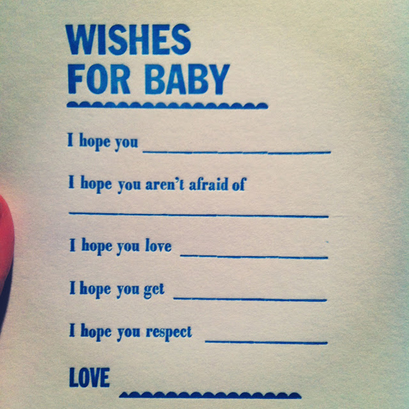
I was looking through some old photos and I came across this cute little number! A photo of an old print I did back when I still had access to a linotype. (AH-MAZING that I have actually been able to use a linotype, forever grateful!) These words still ring so true to me as a reason why I letterpress. As the world gets faster, more efficient, more "perfect"... I have this urge to mess it up... to consciously move a little slower and take my time... to appreciate the process of making a print. I love the slight imperfections. When I print, the world of technology seems to not exist around me... (except for a random instagram photo I take)... I work on a piece of machinery that needs no electricity to run, just sheer human power! And I love it. There's a part of me that wishes more things ran at this pace... a slower and more appreciative pace. I wonder if people would be happier with less technology in their lives? Just something to think about on this lovely sunny Wednesday!

March 23, 2012

Friday night printing


If you read my other blog you probably already know that I'm about to become an aunt! I can't be more excited about it... I love the little guy so much already! A couple of weeks ago I hosted the baby shower and of course I needed to have a little something letterpress printed amoung the festivities. AND Of course I didn't figure out what to actually letterpress until, like, the night before the shower! So here I was, on a friday night, typesetting this "Wishes for Baby" card. I was a bit nervous for the day ahead... I really wanted everything to be just so... I had spent weeks planning and coming up with ideas with the help from one of my bestest creative friends, (hi Sandi!) and on that friday night it was all coming together. Arranging the type just so, having all the pieces in place... kind of interesting how similar it was to planning this event... figuring out how all the pieces will fit together... hoping that it will turn out the way I imagine... interesting to draw the parallel. Do I sounds crazy? hehe... but it was calming. 

That calmness only lastest while I was printing. I think I feel most relaxed when I'm printing. 

I hope you all have a lovely weekend! Thank goodness it's friday.

February 15, 2012

You make me happy...


I hope you had a lovely day yesterday with your sweetie-pies. I didn't have that much time with Justin for Valentine's Day this year... (he had a class to go to for most of the evening), but we're those lucky few that commute together on the subway (or bicycles) everyday, so I just cherished those moments, plus we had a quick dinner before he rushed off. 

In the evening I spent using Justin as my inspiration for some printing. What a great excuse to finally use some borders! I also used 2 sizes of wood type plus a bit of lead type for this print. It was the first time that I used a scale to mix my ink. It was a bit weird actually... and involved a bit of math, which was challenging to do with my right brain... but eventually I figured it out! Have you ever done that?! Mixed ink by weighing it?! It's a bit crazy, and one of these days I'll document it, so you know what I mean (in case you have no idea what I'm talking about). 

I made only a very limited 10 prints. Making them that much more special. I will have them on my etsy store (if it ever gets off the ground)

... and of course these are dedicated to the one that makes me happy when skies are grey. :)

February 9, 2012

Rough Paper test print


My little Kelsey press hasn't really gotten the attention that she deserves. She's constantly being over-shadowed by her much larger older brother (The Vandercook) and barely gets any play time these days. I decided to change that with this little test print. Since the clean up time is basically non-existent in comparison to the vandercook... it makes for some nice quick printing.

I am currently working on a wedding invite design for a pretty cool couple that love all things handmade and vintage! The thought was too use brown box board with blue, red and black ink. At first I thought that it was a great idea, but to make sure how the ink would react with such a rough paper, I thought it would be best to do a text print first. I started with the Skinny Love posters. Using wood type definitely produces more texture as it is... so when I saw the way it was turning out on the box board... I kinda freaked... and started second guessing myself... "maybe it looks a little too handmade..." or a bit too rough. This is a wedding invite, after all! But I think I forgot how cool Steph was.... I sent her this test print with a word of caution... not all the invites will be identical and the texture of the paper is proving to be difficult to work with to get consistent ink coverage...

She was like; "This is great! I like the texture! Identical!? Meh! They're handmade!"

Awesome!

February 3, 2012

In case you needed another reason...


Just in case you need another reason to love letterpress... this is a short video that I found on Fast Company.

January 30, 2012

The Office of Nature + Silverplate Press


The Office of Nature + Silverplate Press from The Office of Nature on Vimeo.


I totally can't believe it! A video with The Office of Nature and Silverplate Press! Back before the holidays started, I invited Katherine (from the Office of Nature) and her hubby Matt over for some good 'ol fashioned letterpress printing. I used to work with Matt when I was just a wee design student, and I gotta say that he was a big contributor to my obsession with handmade design... which eventually lead to a series of shenanigans that ended with having a vandercook in my living room. I am forever grateful. lol.

Katherine is an incredible designer and illustrator - honestly if you're looking for adorable and funky prints for your kids room you totally need to check out her Etsy store; here!

Anyway, back to printing with The Office of Nature... Katherine and Matt came over to meet the Vandercook, and to try their hand at printing on this press. It was a bit of a letterpress workshop in a way... that also came with chilling out between colours, some beers and of course a cheese fondue! It was fun! And I'm really glad that the cards turned out so well! The video is totally cool and one of these days I will have to ask Katherine to make me a Silverplate promo video! Ha. Maybe we'll do tradesies for some printing. lol.

The photos and the video are from The Office of Nature

January 27, 2012

Skinny Love, part 2


I'm not quite finished this design yet... but thought I'd give you a glimpse of the 2nd colour. I've been sticking to wood type thus far, but I'm thinking of breaking out some good old fashioned lead type for the next round. I gotta say that one of my favourite parts of printing is the test prints... the parts that don't quite work out, it's basically a beautiful ugly poster... perfect in it's imperfections.

Related Posts Plugin for WordPress, Blogger...